7-Step by Step Web Design Process to Create Winning Websites
- Aug 06, 2019
- Satya P.
- News, Web Design
- 9 Mins. Read
We all know that each web app project & its requirements are unique and no design development task can be completed without following some steps or process. A responsive website is the face of your online business because it presents what you want to offer to the online customers. When it comes to design a responsive site a lot of things are there that should be kept in mind after all your online customers are the king and you have to serve them best.
A SEO Optimized, responsive website, user-friendly and customer-oriented sites not only rank on SERP (Google, Bing, Yandex, and Yahoo Search Engines) even it increases your business brand visibility which turns to increase your business leads, thus improve your business sales. A well-designed SEO friendly responsive web can take your online business to the next level and your responsive website can serve as an online catalog for your products or services.
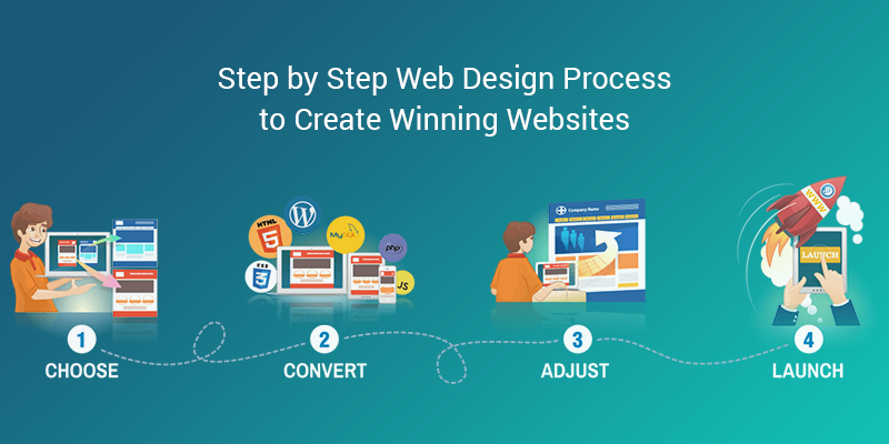
Creating a responsive site is not an easy task because it should be perfect in all ways. A successful custom coded responsive website is not built in a day or a week as it takes time. Every responsive web design and development process is consists of some steps. From understanding the project's need for the successful delivery of a project, all steps are mandatory. Here are some successful steps that should follow while creating a responsive website to get the best results for your online business.
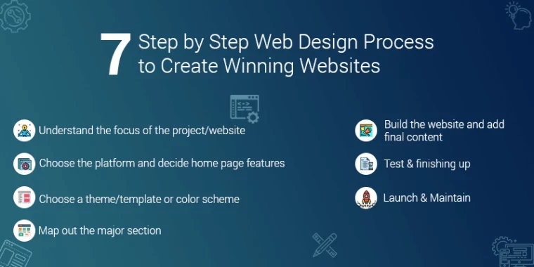
1. Understand the focus of the project/responsive website:
The most important step of the responsive web design process is to understand the focus of the project or need of the website. Before starting out, you need to know the main purpose of the client behind the responsive website creation. Responsive Web designers should always a brief outline of the project/ responsive website so that they can give their best results in responsive site creation.
Before initiating the responsive website design you need to know some questions to be answered from the client’s side like; what is primary aim of the responsive site design – selling the product, informing, service provider, getting the sign-ups of user for newsletter or anything else?, Who will be the target audience?, Will it be an e-commerce website? What are the benenfits of a responsive web? How to hire a responsive web designer? And so more questions.
Once a responsive web designer will understand the clear purpose of responsive web it will become easy for him or her to create the responsive website according to requirement. Click here to hire responsive web design service for your online business website.
2. Choose a theme/template or color scheme:
How to select color of a responsive website? what fonts and texts used in the responsive site? A beautiful responsive website always catches the attention of everyone as well as online customers whether it is your prospective customer or not. Sometimes users purchase from the responsive websites just because they liked the responsive site structure and its functionality.
A SEO optimized, user-friendly, UI/UX designed and responsive website converts your potential customer into the confirmed customer, means to turm your leads into sales. So when it comes to the selection of color scheme and theme of a responsive business website it should be perfect and elegant.
Responsive Web designers should be present some color scheme and template options in front of the client so that the client can make the decision wisely and approve you to go ahead with the next step. A website should not only be attractive in view it should be the responsive too so a user will not face any issue while dealing with the website. Web designer team should always keep in mind that they will provide the best responsive web design services to their clients.
3. Choose the platform and decide home page features:
Once the goals are clear in mind the next step is choosing the best platform for the responsive site. Yes, a responsive website structure should be according to its goals. If a responsive website is only for blogging purpose or information, news provider then there are various platforms to opt as some of them like WordPress, Laravel, Cake PHP, Zend and many more.
And if your responsive site purpose is selling a product or we can say an online ecommerce website then there are so many platforms like Magento, OpenCart, Joomla, Shopify, Craft CMS and many more. After finalizing the platform what features or icons should be on the home page is the most important thing to discuss with the client.
Because a responsive website’s home page shows what is inside the website and it should be the best. Being a top custom web development company, W3care suggests to its clients that the home page should be the crux of your all services and products and all the important features are mentioned in the section "Above The Fold". We always understand the need of our clients and provide the best solutions for responsive website design and development.
4. Map out the major section:
When the above steps are successfully done you can initiate the responsive designing of the website. You can sketch out the quick diagram of the website on paper with all the major section and features. Once you sketch out the diagram on paper then you can create a wireframe or PSD of responsive website design. While creating the PSD makes sure you are not forgetting any major thing that should be on the website in the main view.
Make your responsive website PSD with appealing images and attractive font styles so that the client can give you a green signal in the first time for the next phase. Make the Section "Above the Fold" more creative and intuitive of your online business website.
5. Build the responsive website and add final content:
After the completion of the above steps, this is the time when you can start the custom coding process. At this stage, you can create external CSS and HTML of the responsive website and hand over it to the web development team for the further customized coding process. On this stage make sure that you are checking the responsive website on frontend and backend both side.
Most of the responsive websites add the content after the launching of the responsive website but we recommend that it should be along with coding part so the web designing team can understand the issues if there are any and can suggest according to the responsive website layout. Once the content is provided by the content writer you can easily manage it with the coding part and optimize according to SEO standards.
6. Test & finishing up:
This is one of the most important steps of the responsive website design process. A top custom web development company always delivers best to their clients and to make a website best testing part is mandatory. Once the designer and developer team is done with their tasks then the responsive website should be handover to QA and testing team.
At this stage Quality analysts and tester tests website’s functionality, responsiveness, compatibility, performance, usability, security and many more significant things. Although a responsive website before launching should be checked thoroughly and some things are should be checked twice or more like all the links that should be landed on the right page.
Content should be readable and easy to find. The site should be responsive on all devices like mobile, desktop, iPad, tablet and more. The loading speed of the website should be very low i.e a website should load in 3 seconds. A professional QA and testing team always take proper and required time to check the responsive site before it goes live and provides best QA and testing services.
7. Launch & Maintain:
Last but not the least; at this step, you are ready to show your responsive website to the online world. For this, you have to transfer your responsive site from local server to live server. This is not only the step of the responsive web design process even your required goal also which you’ve desired. Now your website is ready to sell products, providing information or whatever mission for which you’ve designed the website which can be achieved via SEO SMM PPC Digital marketing services.
But the launch of the website is not the end of responsive web design and development process as it too require maintainance services. We at W3care custom web development company not only design develop responsive sites, but also provide website maintenance services to clients who are living in USA, India, France, Germany, Australia, UK, Ireland, Canada, Japan, Spain, Switzerland, Belgium and all 190+ countries around the world.
Yes, we provide high quality web maintenance services along with the website design and development process.
Above steps are the most important steps to follow while creating a responsive website. If you are thinking to create your responsive website own than follow the above steps and surely it will make your website results oriented or in case you want your own business website but don’t want to make it by yourself then contact +1 (408)-757-0455 W3care Technologies Pvt. Ltd. today.
Being a top web design company we provide responsive web design services to our worldwide clients at most affordable prices. If you already have a website but not happy with it, then you also contact us for responsive website redesign services. Our professional web designing team offers you the best intuitive, appealing, creative, ui/ux freindly, seo optimized and responsive website design services at best prices.
More About W3care Technologies Pvt. Ltd.
W3care is a pioneer responsive site designing service provider in USA. We design attractive, creative, Intuitive and stunning responsive websites for various business industries that drive more traffic to your online site which in turn can generate more leads from it. These leads can be converted into Sales.
Entrepreneurs, Small and medium-sized enterprises, businesses, SME Business Owners living in USA States Alabama, Alaska, American Samoa, Arizona, Arkansas, California, Colorado, Connecticut, Delaware, District of Columbia, Florida, Georgia, Guam, HawaiiIdaho, Illinois, Indiana, Iowa, Kansas, Kentucky, Louisiana, Maine, Maryland, Massachusetts, Michigan, Minnesota, Mississippi, Missouri, Montana, Nebraska, Nevada, New Hampshire, New Jersey, New Mexico, New York, North Carolina, North Dakota, Northern Mariana Islands, Ohio, Oklahoma, Oregon, Pennsylvania, Puerto Rico, Rhode Island, South Carolina, South Dakota, Tennessee, Texas, Utah, Vermont, Virgin Islands, Virginia, Washington, West Virginia, Wisconsin, Wyoming Call +1 (408)-757-0455 W3care regarding desingin and development of responsive websites for online businesses.
- Still Running PHP 7.4? Upgrade Before It Costs Your Business
- How Businesses Are Being Targeted by Modern Cyber Fraud in 2026
- W3care Recognized as a Top Firm by 50Pros (Spring 2026)
- The Hidden Cost of Cheap Web Development
- W3care Featured in Evan Kirstel’s Trusted IT Providers — Clutch B2B Expert Picks
- W3care Becomes a Craft Commerce Verified Partner
- Downtime Doesn’t Sleep: W3care Launches 24×7 Support
- Delivering Consistent Quality: W3care Achieves ISO 9001:2015
- Smarter, Faster Digital Platforms with Craft CMS and AI
- WordPress 6.9: What Business Owners and Agencies Need to Know for Smarter Site Management