


Website Redesign Services Built for Better Performance, UX and Growth
Modernize your existing website with a faster, mobile-first and conversion-focused experience designed to improve usability, search visibility and long-term business performance.
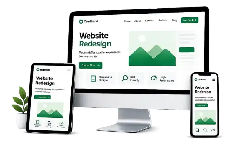
More Than a New Look — A Better Performing Website
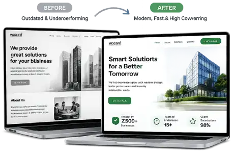
A website redesign goes beyond aesthetics. We create digital experiences that improve performance, build trust, and drive real business growth.
-

4000+ Modern User Experience
Create intuitive, engaging experiences that keep visitors engaged and coming back.
-

Mobile-First Design
Deliver seamless, responsive experiences across all devices and screen sizes.
-

Faster Website Performance
Optimized for speed and Core Web Vitals to ensure better rankings and user satisfaction.
-

Higher Conversion Rates
Strategic layouts and clear CTAs that turn more visitors into leads and customers.
-

Stronger Brand Presence
Refresh your visual identity and messaging to build trust and credibility.
-

Better Search Visibility
Clean code, optimized structure and SEO best practices for long-term organic growth.
Responsive Web Design Features
 Mobile-first design
 Fluid layouts
 Cross-device compatibility
 Accessibility standards
 Fast-loading pages
 SEO-friendly architecture
 Core Web Vitals optimization
 Touch-friendly UI
 Retina-ready graphics
A Structured Approach to Modernizing Your Website
For over 16 years, W3care Technologies has helped startups, agencies, enterprises and growing businesses redesign and modernize digital platforms with a clear focus on user experience, performance, SEO, scalability and long-term maintainability.
Website Audit & Discovery
We review your current website, business goals, audience, content, technology and key performance issues to define the right redesign strategy.

UX & Information Architecture
We improve structure, navigation and user journeys so visitors can find information more easily and move naturally toward key actions.

Wireframing & UI Design
We create clear page structures and modern interfaces that reflect your brand while improving usability and engagement.

Development & CMS Integration
We build the redesigned experience using responsive, maintainable frontend architecture and integrate it with your existing or upgraded CMS.

QA & Cross-Device Testing
We test functionality, responsiveness, browsers, devices and key user journeys before launch.

Performance & SEO Validation
We optimize speed, Core Web Vitals and technical SEO while checking redirects, metadata and other migration-sensitive elements.

Launch & Ongoing Support
We manage deployment carefully and provide continued maintenance, optimization and technical support after launch.
Performance-Focused Website Redesign
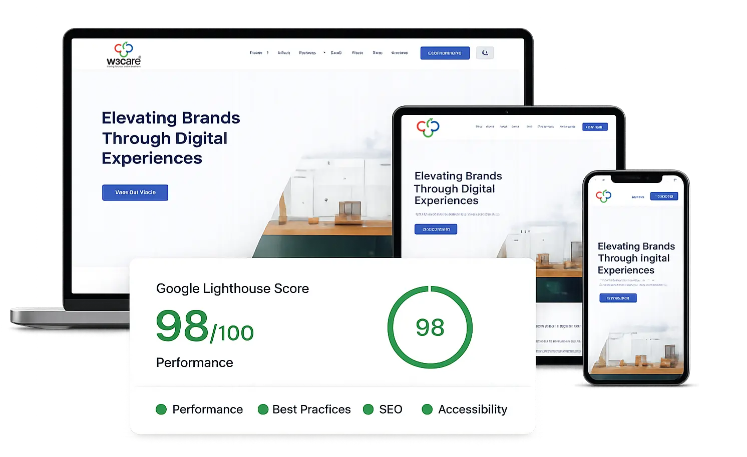
We redesign websites with performance built into the process, improving speed, mobile usability, search visibility and overall user experience across devices.
Our frontend architecture focuses on lightweight code, optimized assets, faster rendering, and mobile-first performance standards to help improve engagement and SEO rankings.

Core Web Vitals Optimization
Improve LCP, CLS and INP through performance-focused frontend development and asset optimization.

Fast Mobile Experience
Create responsive, touch-friendly layouts designed for faster loading and easier interaction on mobile devices.

SEO-Friendly Architecture
Use clean semantic structure and technically sound markup to support crawlability, discoverability and search performance.

Optimized Images & Assets
Use compressed assets, modern image formats and efficient loading techniques to improve rendering performance.

Lightweight Frontend
Reduce unnecessary frontend overhead with efficient CSS and JavaScript architecture designed for maintainability and speed.

Cross-Browser Compatibility
Deliver a consistent experience across modern browsers, devices and screen sizes.
Up to 60%
Faster Mobile Load Times
90+
Mobile Optimization Score
100%
Responsive Compatibility
Included
SEO-Ready Structure
Why Businesses Choose W3care
- Mobile-first responsive development
- SEO and Core Web Vitals focused approach
- Dedicated project managers
- Transparent communication
- Long-term maintenance support
- Cross-browser and multi-device compatibility
- Scalable architecture for future growth
- Experienced frontend and backend engineering team
A Reliable Technology Partner for Long-Term Growth
We don’t just create responsive websites — we build fast, scalable, and conversion-focused digital experiences that help businesses grow confidently across desktop, tablet, and mobile devices.
Testimonials

Alejandro Ligeti Manager, Web and Technical Projects USA

W3Care has provided enormous expertise and value on several web development projects. Their creative thinking and engineering expertise has allowed us to innovate our product offering. Their detail oriented approach to project management and high-level communication ability, makes working with them a win-win experience for everyone involved.
Frequently Asked Questions
Responsive web design is an approach where a website automatically adjusts its layout, content, and elements to fit different screen sizes and devices. Whether someone visits your website on a desktop, tablet, or smartphone, the experience remains smooth, user-friendly, and visually consistent.
Today, most users browse websites on mobile devices. A responsive website helps improve user experience, engagement, search engine visibility, and overall accessibility. It also ensures your website looks professional and functions properly across all modern devices and browsers.
Yes. Responsive design is built specifically to create a mobile-friendly experience. It allows your website to adapt to smaller screens, touch interactions, and different resolutions without requiring a separate mobile website.
A mobile-friendly website may simply work on smaller screens, but responsive design goes further by dynamically adjusting layouts, images, content, and navigation for every device size. Responsive websites provide a more consistent and optimized experience across desktops, tablets, and smartphones.
Yes. We develop responsive websites that are tested across major browsers, screen sizes, and devices to ensure consistent functionality, appearance, and performance for your users.
Our team works with a wide range of modern technologies and platforms including WordPress, Craft CMS, ExpressionEngine, Shopify, Laravel, PHP, React, Vue.js, and custom frontend frameworks depending on your project requirements.
Absolutely. We can redesign and modernize your existing website to improve responsiveness, user experience, performance, SEO, and overall visual appeal while maintaining your brand identity.
Yes. If your current website feels slow or difficult to use on mobile devices, we can optimize its performance by improving loading speed, responsive layouts, Core Web Vitals, image optimization, and frontend efficiency.
The timeline depends on the size, complexity, and features of the project. Smaller websites may take a few weeks, while larger or custom platforms may require additional planning and development time. After understanding your requirements, we can provide a more accurate timeline.
The cost varies based on the project scope, design complexity, integrations, features, and technologies involved. We offer flexible solutions for startups, businesses, and enterprises based on their goals and requirements.
Yes. We provide ongoing website maintenance, updates, monitoring, technical support, security improvements, and performance optimization to help keep your website running smoothly after launch.
Responsive websites create a better user experience by making it easier for visitors to browse, navigate, and interact with your content on any device. Faster loading times, improved usability, and mobile-friendly layouts often lead to higher engagement, better retention, and increased conversions.